Names_Ash_Housewares
Global Moderator
Evil Force
    
Posts: 258
Evil Dead Collector

|
 |
« Reply #15 on: December 19, 2007, 02:20:24 AM » |
|
Not bad, they could have made the Disc image match the background they are on though....
|
|
|
|
|
 Logged
|
 Member of Deadites Online Since 2001 |
|
|
Kain
Evil Webmaster
Administrator
S-Mart Clerk
    
Posts: 65
Evil Webmaster


|
 |
« Reply #16 on: December 19, 2007, 02:52:56 AM » |
|
I got my copy of the Ultimate Edition yesterday. I'm somewhat disappointed with the packaging. I wish they included new background art and a booklet as well. Didn't check out disc 1 or 2. The third disc is good though. I wish the Ladies showed more interviews with fans at the convention. I guess I didn't make the cut lol. The ladies interviewed me a few years back at Cinema Wasteland. Oh well.
|
|
|
|
|
 Logged
|
|
|
|
xage
Primitive Screwhead

Posts: 20

|
 |
« Reply #17 on: December 19, 2007, 03:28:51 AM » |
|
Not bad, they could have made the Disc image match the background they are on though....
Yeah! they could have made it that way but then again, Anchorbay re-used art of the original Evil Dead THX Disc art for disc one. I got my copy of the Ultimate Edition yesterday. I'm somewhat disappointed with the packaging. I wish they included new background art and a booklet as well. Didn't check out disc 1 or 2. The third disc is good though. I wish the Ladies showed more interviews with fans at the convention. I guess I didn't make the cut lol. The ladies interviewed me a few years back at Cinema Wasteland. Oh well.
I do agree with you! It seems that Anchorbay did not put much effort for atleast re-inventing the art of the Package as they only reprint the arts used in previous Evil Dead DVD releases they had. Disc Packaging Art (Inner and Outer) 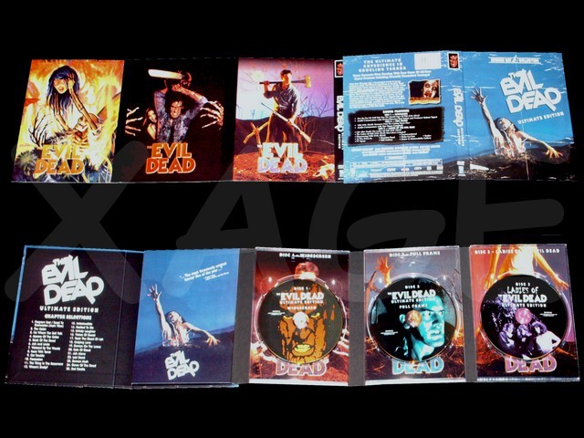 reference Anchorbay DVDs  |
|
|
|
|
 Logged
|
|
|
|
|
Joda
|
 |
« Reply #18 on: December 19, 2007, 06:26:27 AM » |
|
I prefer the art on those older Anchorbay releases... But this new set is still worth it, especially considering Best Buy had it for only $16.99.
|
|
|
|
|
 Logged
|
|
|
|
xage
Primitive Screwhead

Posts: 20

|
 |
« Reply #19 on: December 19, 2007, 07:05:26 PM » |
|
And if you get either Halloween or Hatchet you get an additional $5 off
|
|
|
|
|
 Logged
|
|
|
|
|
Joda
|
 |
« Reply #20 on: December 20, 2007, 02:06:58 AM » |
|
And if you get either Halloween or Hatchet you get an additional $5 off
Yep! I actually told the cashier, "Groovy!" Sadly, they were like huh? |
|
|
|
|
 Logged
|
|
|
|
xage
Primitive Screwhead

Posts: 20

|
 |
« Reply #21 on: December 24, 2007, 03:43:27 PM » |
|
Im not that technically meticulous with the aspect ratio and picture quality of the film however below are the are the screencaps I got from the four different Evil Dead DVD releases. A great reference to the rest who would like to see the differences in picture quality 1998 Anchorbay Release(from the Super Jewel Case) 1.33:1 Aspect Ratio 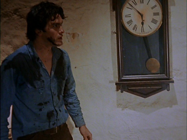 1999 Elite Release 1999 Elite Release1.33:1 Aspect Ratio 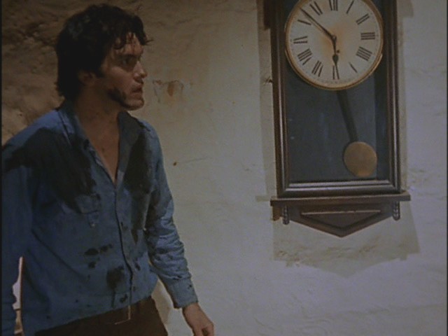 2002 Anchorbay THX/Book Of the Dead Release 2002 Anchorbay THX/Book Of the Dead Release1.85:1 Presentation 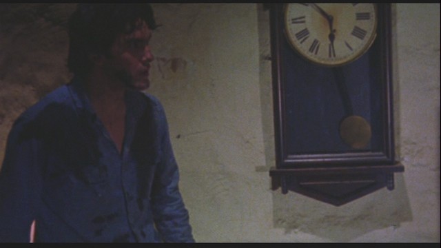 2007 Anchorbay Ultimate Edition 2007 Anchorbay Ultimate Edition1.85:1 Presentation 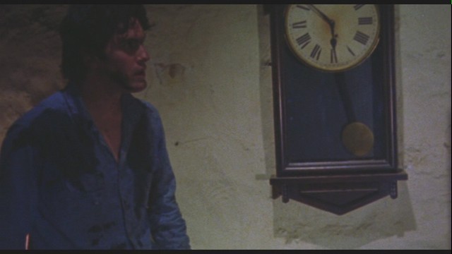 |
|
|
|
|
 Logged
|
|
|
|
xage
Primitive Screwhead

Posts: 20

|
 |
« Reply #22 on: January 11, 2008, 04:10:20 AM » |
|
Just sharing an updated photoshot of all Evil Dead releases in DVD/UMD/HD/BluRay North America Region And for those who were wondering why there were Two Ultimate Edition Evil Dead DVDs, they were basically different in packaging. Here is the close image of the two Evil Dead Ultimate Edition ( One is a French Canadian Release and the other is the Regular USA release) |
|
|
|
|
 Logged
|
|
|
|
tim-bisley
S-Mart Clerk
 
Posts: 99
Goonies Never Say Die. and One of us Pwned Jason..

|
 |
« Reply #23 on: January 11, 2008, 05:46:36 AM » |
|
this ever getting a uk release?
|
|
|
|
|
 Logged
|
|
|
|
|
Brandon
|
 |
« Reply #24 on: January 11, 2008, 10:25:39 PM » |
|
Of those four screecaps, I prefer the quality of the 1998 and 1999s. The 2002 and 2007 have changed very little. But I did like the cover art of the box.  |
|
|
|
|
 Logged
|
|
|
|
xage
Primitive Screwhead

Posts: 20

|
 |
« Reply #25 on: January 13, 2008, 12:39:41 PM » |
|
I didnt like the coverbox, they should have made it clean rather than a scanned image of a folded poster.
|
|
|
|
|
 Logged
|
|
|
|
xage
Primitive Screwhead

Posts: 20

|
 |
« Reply #26 on: March 09, 2008, 09:52:05 AM » |
|
For those who have HDs .. Universal's press release yesterday
Officially Discontinued:
Army Of Darkness
Format: DVD & HD-DVD Combo
Production: Universal
MSRP: $34.98
UPC CODE: 025192791024
Hmm!... First Discontinued Evil Dead High Def Disc!
|
|
|
|
|
 Logged
|
|
|
|
Omni
S-Mart Clerk
 
Posts: 86
Photoshop Beards, fun yet stylish


|
 |
« Reply #27 on: March 09, 2008, 11:52:20 AM » |
|
I didnt like the coverbox, they should have made it clean rather than a scanned image of a folded poster.
well its really impossible to scan a poster because all posters are glossy and you cant scan glossy things without screwing up the final image so they had to photoshop in the creases and other aging effects.  |
|
|
|
|
 Logged
|
Das Boot
|
|
|
xage
Primitive Screwhead

Posts: 20

|
 |
« Reply #28 on: April 20, 2008, 06:38:03 AM » |
|
Anchorbay/Starz can reprint anything they wanted for their DVD distribution. Are you telling me that "literally" they cant scan an image? or areyou referring to the "household scanner"?? The "impossibility" you have mentioend seems odd... and given you also include an odd "the more you know" embedded graphics in it??? well its really impossible to scan a poster because all posters are glossy and you cant scan glossy things without screwing up the final image so they had to photoshop in the creases and other aging effects.  for reference... these were the back to back poster insert of the DVD... even if there was a classic touch on the other end.. they should have made it with no creased in the DVD cover... but heck.. each has its own opinion...  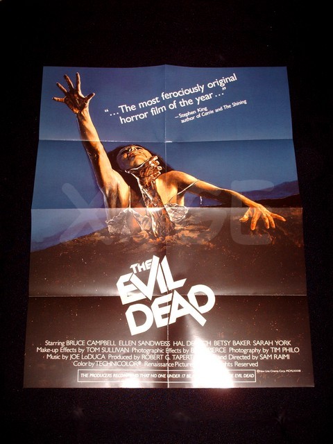 |
|
|
|
|
 Logged
|
|
|
|
djsmokingjam
Primitive Screwhead

Posts: 26

|
 |
« Reply #29 on: April 20, 2008, 11:28:33 PM » |
|
The cover art is shown "uncreased" in the booklet, so they obviously could have done it that way - the creases were no doubt added in Photoshop because they wanted a rougher, "more grindhouse" feel to it.
I like the effect myself, and I think it's a kickass release. It's also worth noting the fullframe version restores the lightning strike, loses the zoom-in Cheryl's face and all the other stupid modifications Sam's made to the film in the last decade.
|
|
|
|
|
 Logged
|
|
|
|
|